
One Quick Bakery Brand Fix for Flawless Customer Flow
For local bakers selling out at pop-ups and running wild weekly bread drops, brand identity often takes a back seat. And honestly, that's totally fair—the sourdough starter won’t wait for a graphic design meeting.
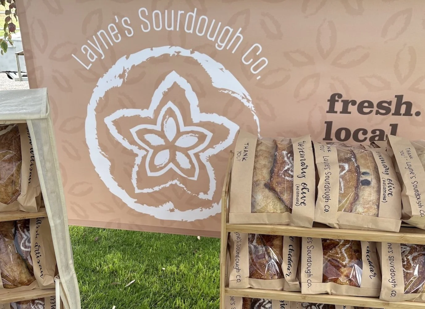
But when your operation starts scaling, a disjointed public presentation creates massive friction. If your printed packaging labels look completely different from your online order menu or your social media accounts, new customers hesitate.
A few tiny, strategic shifts can make your visual presence feel just as intentional and premium as your actual product—without forcing you through a long, painful rebranding process.
The One-Minute Visual System Audit
If you want to eliminate brand debt on your packaging and digital footprint today, start with this single, high-impact rule: Choose exactly one typography framework and one consistent color tone—and stick with them across your labels, your order forms, and your digital channels.
Even this small baseline of consistency does massive heavy lifting for your business:
It forces instant visual recognition when new customers find you at a local market.
It elevates your perceived value, allowing you to confidently command premium artisan rates.
It turns standard utility packaging into a walking billboard for your brand.
Moving Beyond Hand-Written Labels and Instagram DMs
As a food or beverage business grows, reliance on loose, manual systems—like taking orders via chaotic direct messages or scribbling flavor notes on brown paper bags—eventually breaks.
True brand strategy isn't about passive decoration. It’s about building a functional, end-to-end identity framework engineered for real-world execution:
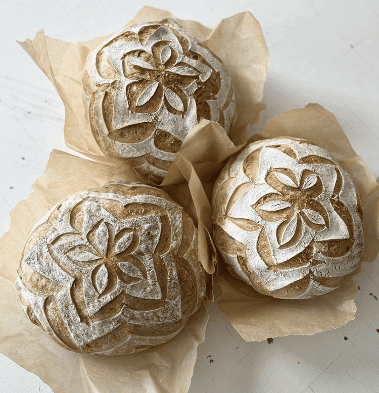
01. Print Collateral That Handles the Heat
Your packaging labels need to print exceptionally clean, fit your specific packaging dimensions flawlessly, and visually communicate premium quality the second an item hits a retail shelf or market table.
02. Frictionless Digital Order Systems
You don't need a bloated, complicated website. You need a dead-simple, conversion-optimized digital layout that handles weekly drops, communicates availability clearly, and processes payments securely without making your customers guess where to click.
03. Jargon-Free Messaging
Your visual infrastructure should instantly tell local buyers exactly what your process is, what ingredients you stand behind, and how to get their hands on your next release before it sells out.
Is Your Brand System Keeping Up With Your Growth?
If your bakery, restaurant, or boutique food brand has outgrown its original setup, you don't need high-gloss corporate fluff. You need a settled, resolved system that takes the operational weight off your shoulders.
Let's look at your current digital footprint, print files, and visual presentation to streamline your pipeline.
Click here to request a free Brand Audit and let's check availability for a strategy call.